Constraints, Not Taste: Building a VS Code Theme as a Non-Designer with ChatGPT, GPT Image 2, Claude Design, and Claude Code
How a non-designer built OperatorDark, a colorblind-friendly VS Code theme, by stacking four AI tools and re-asserting two constraints at every handoff.
I couldn’t find a VS Code dark theme that fit two requirements I cared about: comfortable for long coding sessions, and readable for colorblind developers. The marketplace options I tried either dimmed comments past the point of usefulness, relied on red and green to carry meaning, or pushed contrast hard for screenshot impact rather than sustained reading.
So I built one, OperatorDark, and it took four AI tools to ship: ChatGPT for intent, GPT Image 2 for visualization, Claude Design for UI refinement, Claude Code for the actual theme files.
I’m not a designer. That shaped how the work got done.
The pipeline at a glance
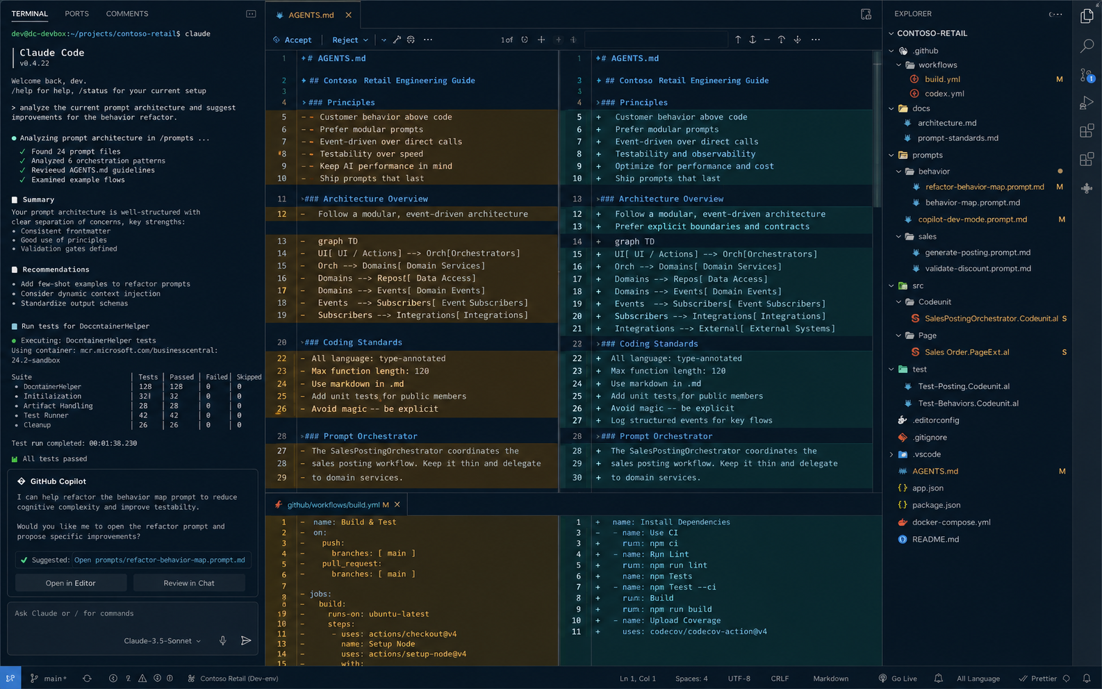
The four tools each held one stage of the work. ChatGPT shaped intent. It interviewed me across several rounds of back-and-forth and turned my answers into a long structured image-generation prompt. GPT Image 2 turned that prompt into ultra-realistic VS Code screenshots, mockups of the intended theme. Claude Design, Anthropic’s design product (launched in April 2026 by Anthropic Labs), took those screenshots plus the original prompt and refined the design surface: palette tokens, sidebar contrast, syntax color assignments. Claude Code translated the refined design into the hundreds of token-to-color assignments VS Code reads (editor, terminal, diff, git decorations, every UI surface), and put it on the marketplace.
 GPT Image 2 mockup of the intended theme. This is not a screenshot of working code; it is an AI-generated image used as a design brief.
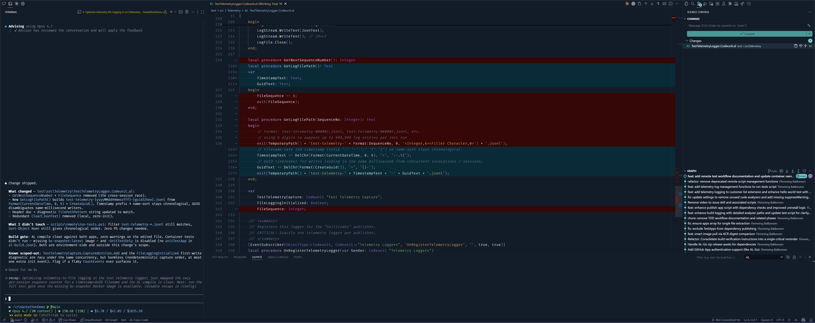 The shipped OperatorDark theme during a real VS Code diff. Same kind of view as the mockup above, this time rendered by VS Code with the actual theme tokens rather than imagined by GPT Image 2.
The pipeline itself is the easy part of the story. The harder question is what kept four different AI tools producing outputs that fit together across the handoffs.
The two constraints that made it cohere
I couldn’t supply design taste. What I could supply was constraints, and I could re-supply them at every handoff. Every prompt to every tool re-asserted the same two non-negotiables: this theme has to be comfortable for long coding sessions, and it has to be readable for colorblind developers. Those two lines went into the ChatGPT prompt, the GPT Image 2 prompt, the Claude Design refinement, and the Claude Code build. Skip either constraint at any handoff and the next tool’s defaults take over, which lean toward higher saturation, stronger visual impact, and choices tuned for screenshots rather than sustained use.
Here’s the constraint excerpt from the GPT Image 2 prompt, the bullets that did the actual work:
- sharp readability first
- colorblind-friendly
- low-fatigue
- avoid red/green-only differentiation for accessibility
- comments soft and readable, never washed out
- no gamer RGB styling
- no cyberpunk exaggeration
- no glossy effects
- no dramatic glow
- restrained cyan/teal accents
- syntax highlighting must prioritize contrast and readability over saturation
The full ~500-word prompt is in a gist. What matters isn’t the length. It’s that those eleven lines went into the next tool, and the next, and the next.
Long-session readability
A theme optimized for marketplace screenshots and a theme used for many hours a day have different requirements. The first has to make an impression quickly; the second has to remain easy on the eyes across a long session.
The long-session constraint ruled out several styling choices common in marketplace themes: heavy saturation, dramatic glow, bright accent colors used liberally, and comments dimmed to the point where they’re hard to read when scanning back through context. It also ruled out pure-black backgrounds. Pure black against light text produces maximum contrast, which forces the eye to keep adjusting between extremes and increases fatigue over a long session. The shipped result uses layered dark navy-charcoal surfaces, slightly different luminance per panel, with the sidebar one notch darker than the editor. Subtle separation without borders. The integrated terminal got the same treatment. A large share of my workday runs through it with Claude Code and other AI agents, so the long-session constraint applied there with equal weight.
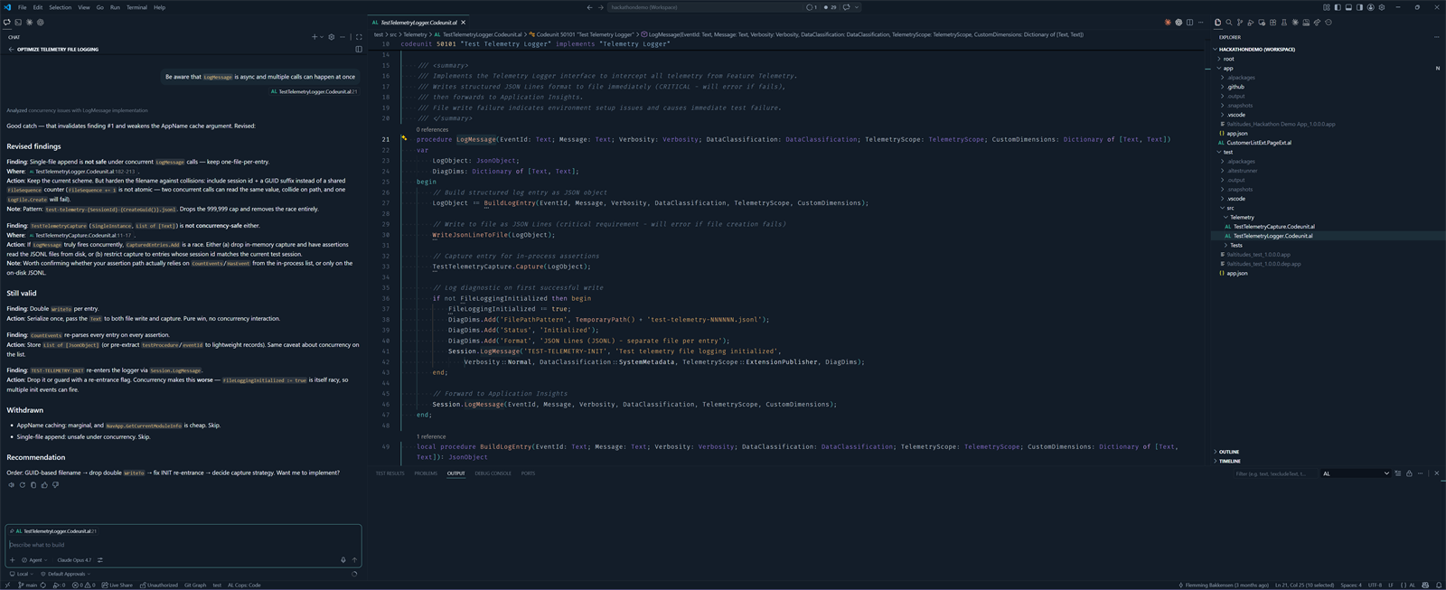 The shipped OperatorDark theme during a typical extended editing session: Claude Code chat on the left, markdown content in the editor, file tree on the right. The view the long-session constraint had to optimize for.
None of the four tools produced a one-shot answer. Each round of work was a conversation, not a single prompt. GPT Image 2’s first pass was already striking, but landing saturation that felt right for a ten-hour session took two or three more iterations. Claude Design’s refinements got tested against “is this still calm enough,” a question that only became answerable through the iterations themselves. Claude Code’s token-by-token assignments meant noticing in context which surfaces still felt loud and which felt right.
The constraint stayed identical across all those iterations, but the iterations were doing two things at once: pushing each tool’s output toward what the constraint required, and helping me, as a non-designer, discover what the constraint actually meant in practice. I came in with constraints, not preferences. Iterating against those constraints, watching the tools propose options, accepting some and adjusting others, was how the preferences emerged.
Holding the constraint stable across every handoff and every iteration did the design work I couldn’t.
Colorblind safety
Red/green is the most common colorblind axis. Roughly 8% of men and 0.5% of women have some form of red-green deficiency. A diff view that uses red for removals and green for additions reads as identical greys to a deuteranopic developer. The same applies to warning-versus-error underlines that differ only in hue, git decorations in the file tree, and syntax tokens that distinguish constants from variables by red-versus-green alone.
The colorblind constraint ruled out using hue as the only distinguishing channel. Where the theme has to encode a difference, it encodes it with luminance and saturation as well, so the distinction is preserved when the hue channel collapses. Cyan/teal accents instead of pure blue-versus-green pairs. Diff colors that differ in lightness, not just in tint. Warning underlines that use a yellow-orange intended to remain distinct from error-red under the common deficiency types.
That’s the design intent, not a validated outcome. The constraint shaped the choices, but whether those choices actually hold up under deuteranopia, protanopia, or tritanopia is something I can’t verify on my own. Feedback from colorblind developers using the theme is how that gap gets closed.
What I’d do differently
This is version one. The rough edges I already know about:
- The integrated terminal palette is bounded by VS Code’s API, which exposes only the 16 ANSI color slots (eight standard, eight bright). That’s a hard ceiling on how finely the palette itself can be tuned, regardless of effort. The expressive choices in OperatorDark’s terminal live in the surface colors and command decorations rather than in the palette.
- Several VS Code theming surfaces (notifications, hovers, peek view, walkthrough panels) weren’t represented in the GPT Image 2 mockups. They got handled at the Claude Code stage with less iteration than the editor, sidebar, and terminal.
What I’d do differently next time is something I can’t honestly say yet. This is the first time I’ve run this pipeline, and one attempt is not enough to tell which observations are about the workflow and which are just about this specific theme. The bullets above name what is rough in version one, not what to change for version two.
The constraint-keeping pattern applies past theming. AI tools are not one-shot tools. Each stage takes iteration, and the human’s role across those iterations and handoffs is to keep the constraints stable while the tools propose, refine, and converge.
Install and give feedback
Install OperatorDark from the VS Code Marketplace. If it works for your sessions, star the repo. It helps with discoverability.
The most useful feedback I can get, especially from colorblind developers, is a specific GitHub issue tagged accessibility describing where the theme fails one of the two constraints. “The git decoration colors in the file tree are indistinguishable under deuteranopia” is more actionable than “colors look off.”
Have a theme workflow of your own, or a take on AI-assisted design as a non-designer? Find me on LinkedIn or X.